 IC Markets




































How to Read Forex Charts
How to read forex charts: the three chart types, market structure and trend, repeating patterns, and using levels to plan trades.
 WriterAbir KhanWriterWrites the guides · checks every figure against primary sources View profileAbout Abir →
 Market analysisTanbir Habib RiyadForex & Crypto AnalystForex and crypto analyst · technical and fundamental analysis View profileAbout Tanbir →
 Fact-checking & riskJannatul FerdaushFact-Checker & Risk AnalystFact-checks every figure · risk analysis · Applied Statistics, University of Dhaka View profileAbout Jannatul →
 Trading reviewJowel RanaCo-Founder & Forex TraderCo-founder · forex trader · reviews guides from a trader's view View profileAbout Jowel →
 Final approvalRanjan NiskrityFounder, Owner & Forex TraderFounder and owner · forex trader · signs off every guide View profileAbout Ranjan →

A forex chart is a graphical record of how two currencies have moved against each other over time. Price sits on the vertical axis, time runs along the horizontal axis, and every candle, bar, or line between them represents real buying and selling decisions made by traders around the world.
Charts are the primary tool of technical analysis. They do not tell you what will happen next. What they do is show you what has already happened clearly enough that patterns and probabilities become visible. Trends, reversals, areas of strong buying and selling interest, and the emotional state of market participants all leave traces on a chart if you know how to look.
Traders who read charts well are not predicting. They are planning. They identify levels where the market has reacted before, recognize the conditions that preceded previous moves, and place trades where the evidence supports a reasonable entry rather than where a feeling or a headline pointed them.
This article covers the three main chart types, how market structure and trends are identified, how to read chart levels for actual trade planning, the most common reading mistakes, and where chart analysis fits within a complete trading approach. If you are completely new to forex, FXRecap’s forex market basics guide is worth reading first.
Why Forex Charts Matter More Than Most Traders Realize
Charts are often described as tools for technical analysis, which is accurate but undersells what they actually show. A price chart is a record of every decision made by every participant in that market during the time period displayed. The candles show where buyers overwhelmed sellers, where sellers pushed back hard, where neither side committed, and where one side panicked.
That information is not available anywhere else in real time. News articles describe what happened after the fact. Economic data explains the fundamental backdrop. But the chart shows the actual response of the market to all of that information as it unfolded.
Consider a week where EUR/USD moves from 1.0800 to 1.1000. A new trader looking at a simple line chart sees a clean upward move. The candlestick chart of the same period tells a different story: repeated tests of support at 1.0890 where buyers stepped in each time, a bullish engulfing candle on the fourth day that marked the decisive shift, and an extended wick on day two showing that sellers tried to push lower and failed completely.
Each of those details reveals something about who was in control, where the pressure was, and how much conviction was behind the move. That is what chart reading develops over time: the ability to look at price movement and understand the behavior behind it, not just the direction.
The Three Main Chart Types and When Each One Helps
Every trading platform offers three core chart formats. They all display the same price data. The difference is how much information each one presents and how clearly.
Line Charts
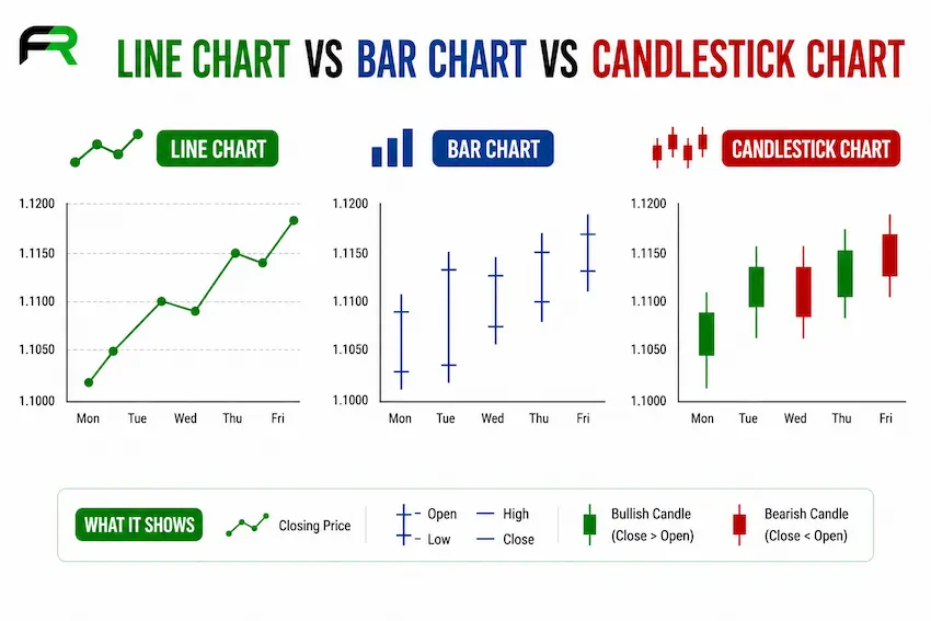
A line chart connects closing prices across each period with a single continuous line. It strips out all the intra-period movement, showing only where price finished. This simplicity is its main strength. The overall trend direction is immediately clear, and the chart is not visually congested.
Line charts are most useful for identifying the broad trend on a higher timeframe before dropping to a lower timeframe for entry decisions. Many professional traders glance at a weekly or monthly line chart to get their bearings before analyzing candlestick detail on shorter timeframes.
Bar Charts (OHLC)
Bar charts show the open, high, low, and close of every period as a vertical bar with two small horizontal tick marks. The left tick is the open, the right tick is the close, and the top and bottom of the bar represent the high and low reached during the period.
Bar charts convey the same information as candlesticks but without the color fill that makes candlesticks easier to read at a glance. Some traders prefer them for a cleaner visual, but the information content is identical.
Candlestick Charts
Candlestick charts are the most widely used format in forex. Each candle shows the open, high, low, and close of a period. The body of the candle represents the distance between open and close. The wicks, sometimes called shadows, extend to the high and low. A bullish candle, where price closed higher than it opened, is typically shown in green or white. A bearish candle is shown in red or black.
The visual character of candlesticks makes patterns much easier to spot than with bar charts. A long lower wick after a sharp sell-off tells you buyers reentered hard and pushed price back up before the candle closed. That is a meaningful signal about where demand is present. The same data shown on a bar chart communicates the same fact but requires more deliberate reading.
FXRecap’s dedicated guide on candlestick charts in forex covers the most important individual candle formations and multi-candle patterns in detail.
The practical approach used by most experienced traders is to combine both. Line or bar charts on higher timeframes to establish trend context, candlestick charts on the trading timeframe for entry timing. Zooming in and out on the same market gives a more complete picture than any single chart type alone.
How to Read Market Structure and Trend Direction
Market structure is the framework underlying every price chart. It describes the sequence of highs and lows that price creates over time and what that sequence reveals about who is in control.
The Three Market States
Markets exist in one of three states at any given time: trending upward, trending downward, or ranging without a clear direction.
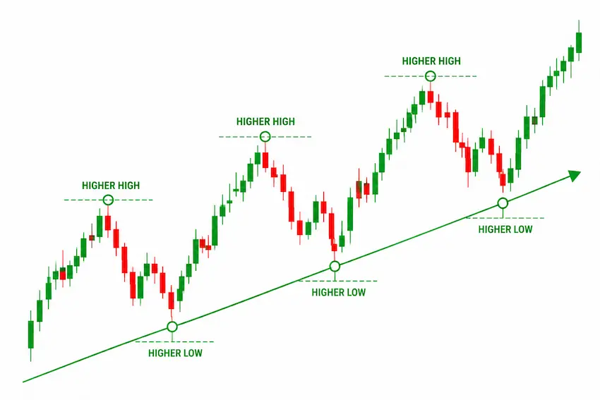
An uptrend is defined by a series of higher highs and higher lows. Each rally reaches a new peak, and each pullback finds support above the previous pullback low. Buyers are consistently willing to step in at higher prices than before. This structure tells you that demand is growing.
A downtrend is the reverse: lower highs and lower lows in sequence. Each rally fails below the previous rally peak, and each decline pushes to a new low. Sellers are consistently more aggressive than buyers, and the market is distributing rather than accumulating.
A ranging market produces no consistent sequence of new highs or lows. Price oscillates between a defined support level and a resistance level without committing to either direction. This often reflects genuine uncertainty or a period of balance between buyers and sellers before the next directional move.
Swing Highs and Swing Lows
A swing high is a peak that has at least two lower highs on each side of it. A swing low is a trough that has at least two higher lows on each side. These points are the building blocks of market structure analysis. They define the turns in the market and establish the reference points from which trend direction is assessed.
When a swing low in an uptrend is broken, it signals that the structure of the trend has changed. Buyers who were defending that level failed to hold it, which suggests that either the trend is weakening or a reversal is developing. This structural break is often a more meaningful signal than any indicator crossover.
Trendlines
A trendline is drawn by connecting two or more swing lows in an uptrend, or two or more swing highs in a downtrend. It provides a visual reference for where price has been finding support or resistance along the direction of the move.
The quality of a trendline depends on the price points used to draw it. Forcing a line to fit where you want it is a common mistake. A valid trendline connects real swing points where the market actually reacted. The more times price has respected that line, the more significant it becomes.
Support, Resistance, and Chart Levels: The Foundation of Trade Planning
Support and resistance are the most practically useful concepts in chart analysis. They describe price levels where the market has previously reversed or stalled, suggesting that buyers or sellers are active at those prices.
Support is a level below current price where buying interest has previously been strong enough to halt or reverse a decline. Resistance is a level above current price where selling pressure has previously been strong enough to halt or reverse a rally. These levels matter because market participants remember them. Traders who missed a previous move at a level will often return to it on the next visit, reinforcing the reaction.
The clearest support and resistance levels are round numbers, previous swing highs and lows, and areas where price has spent time consolidating before making a large move. The more times a level has been tested and respected, the more traders are watching it, which increases the probability of another reaction.
Levels also switch roles. A resistance level that price eventually breaks through often becomes support on a subsequent pullback. This is one of the most reliable behaviors in forex charts and forms the basis of many professional entry strategies.
Trade planning using chart levels looks like this in practice. EUR/USD is forming resistance at 1.1030 and support at 1.0980. A trader planning a breakout entry above resistance calculates: entry at 1.1035 after a clean candle close above the level, stop-loss at 1.1010 which is 25 pips risk, and a target at 1.1085 which is 50 pips reward. That produces a 1:2 risk-to-reward ratio. FXRecap’s guide on stop-loss and take-profit explains how to set these levels systematically rather than arbitrarily.
Without the chart to identify those levels, the trade has no rational basis. The chart is what makes the numbers meaningful.
Chart Patterns Every Trader Should Recognize
Chart patterns are recurring price formations that appear across all timeframes and currency pairs. They develop because the same types of market behavior, accumulation, distribution, continuation, and exhaustion, tend to produce similar visual shapes when plotted over time.
Continuation Patterns
Continuation patterns suggest the prevailing trend is likely to resume after a period of consolidation. The bullish flag is one of the most reliable: price makes a sharp move in one direction, then drifts sideways or slightly opposite in a narrow channel, before breaking out in the original direction. The measured move target is calculated by taking the length of the initial impulse and projecting it from the breakout point.
Pennants and symmetrical triangles follow a similar logic. Price consolidates in a tightening range following a sharp move, then breaks out. The direction of the breakout typically aligns with the prior trend, though this is not guaranteed.
Reversal Patterns
Reversal patterns signal that a trend may be losing momentum and changing direction. The head and shoulders pattern is among the most widely recognized: three peaks where the middle one is the highest, separated by two troughs at roughly similar levels called the neckline. A break below the neckline after the third peak is the traditional entry signal, with a target measured by the height of the pattern projected downward.
Double tops and double bottoms are simpler versions of the same logic. Price reaches the same level twice without being able to break through, then reverses. The second test of the level with weakening momentum, visible on an oscillator like RSI, adds confirmation to the pattern.
Wedges and Channels
A rising wedge forms when price makes higher highs and higher lows but the range contracts as both boundaries slope upward. This pattern often signals exhaustion in an uptrend because buyers are still pushing higher but with decreasing force. A break below the lower boundary is typically bearish. Falling wedges carry the inverse implication.
Price channels are formed by drawing parallel lines connecting swing highs and swing lows in a trend. Trading within the channel means buying near the lower boundary and selling near the upper boundary, or simply using the channel to time entries in the direction of the trend.
Real Case Study: How a Chart Roadmap Worked in Practice
USD/JPY spent most of 2023 in a sustained uptrend, driven by the divergence between Federal Reserve tightening and the Bank of Japan maintaining ultra-loose monetary policy. Many traders either entered too early or chased the move too late, resulting in poor entries with inadequate reward relative to their risk.
Traders working from the chart rather than the news had a different experience. The daily chart showed repeated bullish flag formations throughout the trend: sharp impulsive moves higher, followed by narrow consolidations drifting slightly downward, then breakouts continuing the upward trend. Each flag provided a defined entry point, a logical stop-loss level below the consolidation, and a measurable target based on the length of the previous impulse.
One entry at 142.80 following a clean candle close above a flag boundary used the prior impulse of approximately 170 pips to set a target near 144.50. The trade reached close to that target. The chart did not require predicting what the Bank of Japan would or would not do. It required recognizing a pattern that had appeared multiple times on that chart already and planning the trade around the structure rather than the opinion.
“Good chart traders do not forecast. They plan.”
That distinction is worth holding onto. A trading plan built on chart levels, pattern recognition, and defined risk is repeatable. An opinion about where price should go is not.
How Charts Reflect Market Psychology
Price charts do not just record numbers. They record decisions made under pressure, and decisions made under pressure follow recognizable emotional patterns.
A long upper wick on a candle that closed near its low tells you that buyers pushed price significantly higher during that period, then sellers overwhelmed them and drove it back down before the close. The buyers who entered during that push are now holding losing positions. They will often exit if price returns to that level, adding more selling pressure. That wick is not just a shape on the chart. It is a record of a specific market event with predictable consequences.
Long consolidation ranges after strong moves reflect indecision. Both buyers and sellers are present but neither has enough conviction to commit. The breakout from that range, when it eventually comes, carries the weight of all the trapped positions from the consolidation, which is why breakouts from long ranges often produce extended moves.
Experienced traders read these psychological signals deliberately. They are patient where the chart shows exhaustion. They become cautious where the chart shows false breakouts designed to shake out weak hands. The advantage of this reading comes not from a formula but from time spent with charts learning to recognize what the formations represent in terms of participant behavior.
Timeframes: How to Use Multiple Charts Together
A forex chart does not exist in isolation. The same currency pair looks entirely different on a 5-minute chart compared to a daily chart. Price that appears to be in a strong uptrend on the 1-hour chart may be in the middle of a pullback within a larger downtrend on the daily chart. Ignoring this relationship produces many preventable losing trades.
The standard approach is to use at least two timeframes: a higher timeframe to establish direction and identify major levels, and a lower timeframe to time the entry. A trader who decides to buy EUR/USD based on the daily chart trend will then switch to the 4-hour or 1-hour chart to find a specific entry point that offers a favorable risk-to-reward ratio within that direction.
The rule is simple: the higher timeframe provides the bias and the key levels. The lower timeframe provides the entry trigger. Trading against the higher timeframe direction is possible but requires significantly stronger justification, and most traders reduce their position size in that scenario.
Practicing timeframe analysis on a demo account before applying it with real capital is the most practical way to develop this skill. FXRecap’s guide on forex demo trading explains how to use demo accounts effectively for building these skills without financial risk.
The Most Common Chart Reading Mistakes
Chart reading errors are consistent across skill levels. The same mistakes appear in beginners and in traders with years of experience who have developed bad habits. Knowing them in advance reduces how often they appear.
Ignoring Market Context
Reading a chart in isolation from the economic calendar and broader market environment leads to consistently poor timing. A technically perfect breakout setup that occurs thirty minutes before a major central bank announcement is not a reliable entry. The news can invalidate the setup instantly, and the spread often widens sharply around announcements, making stop-loss placement less effective.
The practical habit is to check the economic calendar before any trade session and know when high-impact events are scheduled for the pairs you are trading.
Overloading the Chart with Indicators
Adding too many indicators does not improve analysis. It produces conflicting signals and slows down decision-making. When three indicators point in different directions on the same chart, the trader is left with the same uncertainty they started with but with more visual noise.
The cleaner approach is to keep the chart readable. A maximum of two or three indicators that serve different purposes, such as one for trend direction and one for momentum, leaves space for the price action itself to be visible.
Forcing Patterns That Are Not There
Traders who already have a directional bias will often find patterns that support that view, even when the evidence is weak. A trendline drawn through only two points is not significant. A head and shoulders pattern where the shoulders are dramatically uneven may not be the pattern it resembles. The chart should be read as it is, not as confirmation of a prior opinion.
The test is straightforward: would another trader with no prior view of the pair look at the same chart and see the same pattern? If the answer is probably not, the pattern is being forced.
Trading Without a Plan
Entering a trade because the chart looks interesting, without a defined entry level, stop-loss, target, and position size established in advance, is not chart trading. It is reacting to a chart. The difference matters enormously because a plan made before the trade is entered is not distorted by the emotional pressure of watching live price movement.
Emotional Trading After Losses
A losing trade has a way of distorting the perception of the next chart setup. A trader who just closed a loss may see the next setup as an opportunity to recover quickly, which leads to taking lower-quality entries with larger position sizes. The chart is the same. The analysis becomes unreliable because the emotional state of the trader has changed.
FXRecap’s guide on forex risk management covers the behavioral side of trading in detail, including how to set rules that limit the damage from emotional decisions.
Risk Awareness: What Charts Cannot Tell You
Charts show probability, not certainty. A pattern that has worked reliably in the past will fail sometimes. That is a fact of trading, not a flaw in the analysis. The goal of chart reading is to find situations where the evidence is tilted in one direction, not to find situations where the outcome is guaranteed.
False breakouts are one of the most common ways chart signals fail. Price moves above a resistance level convincingly, triggering the entries of breakout traders, then reverses back below the level. This behavior is particularly common around round numbers and before major news events. A candle close above the level, rather than an intrabar breach, filters out many false breakouts.
Sudden news events can invalidate any chart-based analysis instantly. A central bank surprise, an unexpected geopolitical development, or a flash crash can move price through multiple technical levels in seconds. No chart analysis can anticipate these events. The defense against them is correct position sizing and defined stop-losses, not better chart reading.
Liquidity also affects chart reliability. Major currency pairs during peak London and New York session hours behave more consistently with technical analysis than exotic pairs or major pairs during thin overnight sessions. Levels that hold during active hours may be breached during low-volume periods simply because fewer participants are present to defend them.
For an overview of how trading session timing affects price behavior and technical reliability, FXRecap’s guide on forex market hours covers the daily liquidity cycle and what it means for when to trade.
The Future of Forex Charting
Charting tools are advancing alongside computing power and data availability. Several developments are already appearing in retail platforms and will likely become standard over the coming years.
AI-assisted pattern recognition is reducing the time traders spend scanning charts manually. Systems trained on historical data can flag chart patterns, divergences, and structural breaks across multiple pairs and timeframes simultaneously, surfacing setups that a single trader would take hours to find manually.
Sentiment overlays are beginning to appear on retail charting platforms. These show the positioning of retail traders in real time, overlaid on the price chart, which adds a behavioral layer to the standard technical view. Institutional order flow tools, previously available only to professional desks, are becoming more accessible to retail traders.
Volatility prediction models are also developing. Rather than using a fixed ATR value from recent history, newer tools project likely volatility ranges forward based on upcoming events and current market conditions, which improves stop-loss and target placement.
What will not change is the foundation. Trend, structure, support, resistance, and pattern recognition will remain the core of chart analysis regardless of how sophisticated the tools become. The traders who understand the principles will be able to use new tools effectively. Those who rely on the tools without understanding the underlying logic will remain dependent on whatever the platform provides.
Summary
A forex chart is not simply a display of price over time. It is a record of market behavior: who was buying, who was selling, where they committed, and where they gave up. Traders who read that record well gain a genuine edge over those who react to price movement without context.
The practical skills are specific. Identifying the three market states. Reading swing highs and lows to assess structure. Locating support and resistance levels with enough history to make them meaningful. Recognizing continuation and reversal patterns and knowing what conditions make each one more or less reliable. Using multiple timeframes to separate the overall direction from the entry timing.
These skills are built over time on real charts. Theory helps establish the vocabulary. Screen time builds the pattern recognition. Keeping a trade journal that records what the chart showed at entry and what actually happened afterward accelerates the learning process considerably.
FXRecap’s education library covers the related topics in more depth: forex indicators for the tools that complement chart structure analysis, forex trading strategies for how experienced traders build complete approaches around chart analysis, and starting forex trading as a beginner for the full practical roadmap.
The market communicates through price. Charts are how you listen. The clearer and more patient that reading becomes, the better the decisions that follow from it.
The team behind this guide
Researched, checked and approved by five forex specialists
Every guide is written, fact-checked and edited before it goes live, and updated when the facts change. Spotted an error? Tell us.
Related Articles
 Education
9 min read
Education
9 min read

 Education
17 min read
Education
17 min read
 Education
5 min read
Education
5 min read
 Education
8 min read
Education
8 min read
 Education
9 min read
Education
9 min read
 Education
7 min read
Education
7 min read