 IC Markets





























Candlestick Charts in Forex
Candlestick charts are one of the most widely used chart types for analysing forex price action. Each candlestick represents the open, high, low, and close prices for a specific time period. Candlestick formations can help identify trends, potential reversals, and momentum shifts when combined with other analysis. Candlestick charts are widely used across many trading styles, including scalping, day trading and swing trading.
 WriterAbir KhanWriterWrites the guides · checks every figure against primary sources View profileAbout Abir →
 Market analysisTanbir Habib RiyadForex & Crypto AnalystForex and crypto analyst · technical and fundamental analysis View profileAbout Tanbir →
 Fact-checking & riskJannatul FerdaushFact-Checker & Risk AnalystFact-checks every figure · risk analysis · Applied Statistics, University of Dhaka View profileAbout Jannatul →
 Trading reviewJowel RanaCo-Founder & Forex TraderCo-founder · forex trader · reviews guides from a trader's view View profileAbout Jowel →
 Final approvalRanjan NiskrityFounder, Owner & Forex TraderFounder and owner · forex trader · signs off every guide View profileAbout Ranjan →
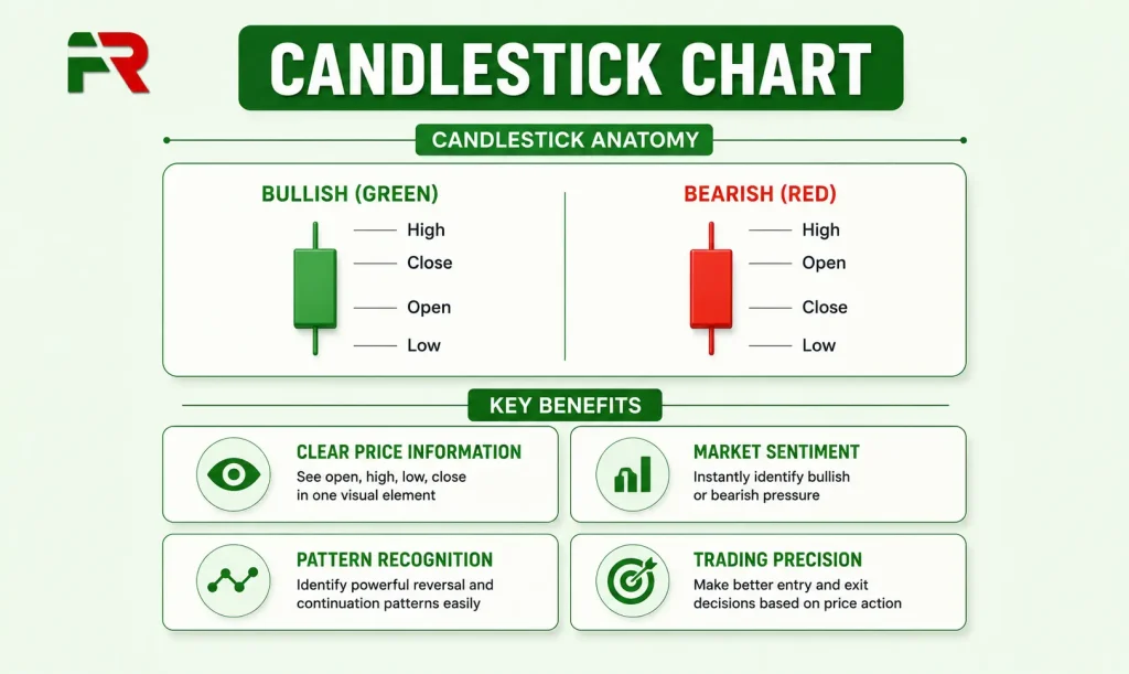
Acandlestick chart is one of the most practical tools a trader can use to monitor how price behaves across time. It displays price movement as candlesticks, each representing four key data points for a given period: the open, high, low, and close. Its real value comes from showing the balance between buyers and sellers during each trading session. A single candle can tell you whether buyers or sellers controlled that period, how far each side pushed, and whether momentum is building or fading. If you are new to forex trading, understanding how to read a candlestick chart is one of the first practical skills worth building.
Every candle has a thick body that sits between the open and close prices, and thin wicks that extend to the session high and low. On most modern trading platforms, bullish candles are usually displayed in green and bearish candles in red, although colours can be customised. A red or black body means the close was below the open, meaning sellers controlled the session. The wicks show how far price pushed in each direction before being pulled back. Together, body and wicks compress a full session of market activity into a shape that is fast to read once you understand what each element means. For a better understanding in reading forex charts, that overview helps explain what follows here.
Beyond identifying trends, candlestick charts often provide early clues that buying or selling momentum is beginning to change. Candlestick charting originated in Japan during the 18th century and later became widely adopted in global financial markets. Munehisa Homma developed it by studying the relationship between price, supply, and trader psychology. Steve Nison popularised Japanese candlestick charting in Western financial markets through his publications during the late 1980s.
The Anatomy of a Candlestick
Before looking at patterns, it helps to understand what each part of a candle actually shows. The thick coloured section between open and close is called the real body. A long body means one side remained in control throughout the session. A short body means neither buyers nor sellers had a clear edge and the session ended near where it began.
The upper wick: The line extending from the top of the body to the session high. A long upper wick means buyers pushed prices higher during the session but sellers drove them back down before the close. The longer the upper wick, the more aggressively sellers defended those higher price levels.
The lower wick: The line extending from the bottom of the body to the session low. A long lower wick means sellers pushed prices down but buyers stepped in and drove the close back up. It signals buying interest at lower levels.
No wick or very short wick: A candle with almost no wick on one end means one side controlled the session from open to close with no meaningful pushback. These are sometimes called Marubozu candles and indicate strong directional conviction.
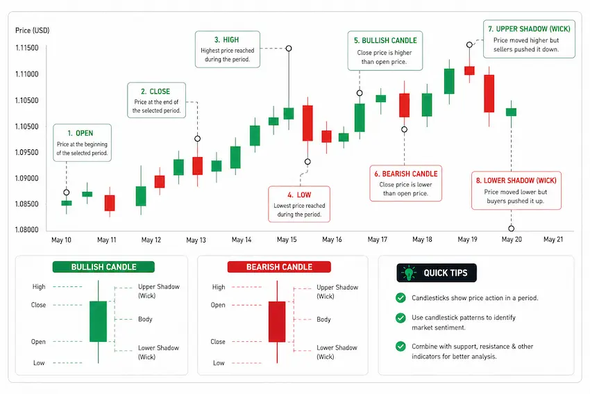
These same four data points, open, high, low, and close, appear in standard forex price quotes on any platform and in a bar chart format. What candlesticks add is colour coding and a visual format that makes the relationship between those four numbers easy to recognise. A line chart shows only closing prices. A candlestick keeps all four price points and makes it clear who won each session, how convincingly, and how much resistance they faced.
Why Candlestick Charts Show More Than Price
Every trader wants to understand where price is most likely to move next. Candlestick charts do not answer it directly, but they show the interaction between buyers and sellers between buyers and sellers in real time, and that is often more useful than a lagging indicator reading. Consider EUR/USD trending upward for three consecutive hours. Then one candle appears with a long upper wick and a small body. Without reading a single number, you can see that buyers attempted to push higher and sellers pushed price lower. The close ended well below the session high. buying pressure may be fading. Understanding the bid and ask mechanics behind this helps explain it directly: buyers lifting the offer push price up, sellers hitting the bid pull it back, and the candle records exactly where each side ran out of conviction.
Each candle captures the overall market activity of every participant who traded during that period. A long lower wick tells you sellers tried to push prices down and failed. A small body tells you neither side was committed. A large body with no wicks tells you one side remained in control from open to close. These patterns represent real buying and selling activity at specific price levels. They reflect real supply and demand at specific price levels, during specific trading sessions, on real currency pairs. Candlestick analysis can be applied to all currency pairs and timeframes, although reliability varies depending on liquidity and market conditions. Traders rely on them because Price action is the foundation of technical analysis, while most indicators are derived from historical price data.
A Practical Example of Candlestick Analysis
A long position in GBP/JPY during the quiet Asian session. The trend was rising, momentum was positive, and the technical indicators were all supportive: RSI, moving averages, and most technical conditions supported the trade.
Ten minutes in, a massive bearish engulfing candle appeared and completely covered the previous bullish candle.
That many traders experience this situation. The indicators still looked supportive. The trend had been clear. The signal felt wrong to act on.
Two candles later, the price had dropped 85 pips.
The bearish engulfing pattern provided an early warning before the move happened. Most technical indicators react after price has already moved because they are derived from historical data. The market had already moved. The lesson is direct: candlestick patterns react in real time to what buyers and sellers are doing right now. Indicators follow price. Candlesticks are price.
How to Read a Single Candle
Suppose EUR/USD opens a 1-hour candle at 1.0840 and closes at 1.0880. The high was 1.0892 and the low was 1.0834. The body represents 40 pips of buyer-controlled movement. The upper wick from 1.0880 to 1.0892 tells you sellers pushed back at higher prices and capped the rally at that level. The short lower wick from 1.0840 to 1.0834 tells you sellers briefly dipped below the open but buyers absorbed that pressure immediately.
From one candle you already know: buyers were in control, sellers made a noticeable attempt to cap the move at 1.0892, and the opening dip was quickly rejected. If subsequent candles keep failing to close above 1.0892, you have the first sign of resistance forming at that level. That is candlestick reading in practice: not prediction, but close observation of who is doing what, at which price, and with how much conviction.
The Candlestick Patterns Commonly Used
Dozens of candlestick patterns have been documented over time, although traders typically focus on a smaller group. Most working traders focus on a smaller set that appears frequently on liquid major currency pairs and have well-established track records. Here are the ones that matter most in real trading situations.
Single-Candle Patterns
Doji: The open and close are at nearly the same price, producing a very small body or no body at all, with wicks extending in both directions. A doji represents indecision: neither buyers nor sellers finished the session with an advantage. On its own it signals a pause rather than a reversal, but a doji forming at the end of a strong trend, particularly at a known support or resistance level, often precedes a direction change. There are three main types: the long-legged doji shows significant back-and-forth with neither side winning; the gravestone doji shows buyers pushed higher but sellers drove everything back to the open; the dragonfly doji shows sellers pushed lower but buyers recovered everything by the close.
Hammer: A small body at the top of the candle with a long lower wick at least twice the length of the body, and little to no upper wick. Hammers form during downtrends and signal that sellers pushed prices sharply lower but buyers absorbed all that pressure and drove the close back near the open. The lower wick is the clear sign of buying interest at lower prices. The wick ideally should be two to three times the length of the body for the pattern to become more reliable.
Shooting Star: The mirror image of the hammer. A small body at the bottom of the candle with a long upper wick and little to no lower wick. Shooting stars form during uptrends and signal that buyers pushed prices significantly higher but sellers stepped in and drove the close back near the open. The long upper wick shows seller rejection of higher prices. Most reliable when it forms after an extended move up, near a known resistance level.
Marubozu: A full-body candle with no wicks or very short ones. The session opened at one end and closed at the other with no meaningful pushback from the opposing side. A bullish Marubozu signals strong buyer control from open to close. A bearish Marubozu signals strong seller control throughout. These are strong momentum candles and often precede continuation in the same direction.
Two-Candle Patterns
Bullish Engulfing: Bullish engulfing patterns are generally considered more reliable when they appear at key support levels and are confirmed by subsequent price action. The larger the second candle relative to the first, the stronger the signal.
Bearish Engulfing: The reverse. A bullish candle followed by a bearish candle that fully engulfs it. Sellers erased the previous session’s gains and pushed the close below the prior candle’s open. Most reliable as a reversal signal at the top of an uptrend near resistance. The GBP/JPY example earlier was exactly this pattern.
Harami: A large candle followed by a smaller candle whose body sits entirely within the body of the first. The smaller candle inside the larger one signals fading momentum. A bullish harami, a small bullish candle inside a large bearish candle, suggests the downtrend may be weakening. A bearish harami suggests the uptrend may be stalling. Confirmation on the following candle is worth waiting for before acting.
Three-Candle Patterns
Morning Star: A three-candle bullish reversal signal. The first candle is a large bearish candle continuing the downtrend. The second is a small-body candle or doji showing indecision. The third is a large bullish candle closing well into the body of the first. Together, the three candles show sellers losing control, a period of uncertainty, then buyers gaining clear control. The signal strengthens if the second candle gaps away from the first and the third candle opens with a gap upward.
Evening Star: The bearish version of the Morning Star. A large bullish candle, a small-body or doji candle, then a large bearish candle closing well into the first candle’s body. Signals the potential end of an uptrend as buyers lose conviction and sellers take control.
Three White Soldiers: Three White Soldiers is primarily regarded as a bullish reversal pattern following a downtrend.
Three Black Crows: Three Black Crows is primarily regarded as a bearish reversal pattern after an uptrend..
Price Action Patterns
Pin Bar: One of the most widely used candlestick-based patterns in forex price action trading. A pin bar has a small body near one end of the candle and a long wick on the other side, with the wick being at least two to three times the length of the body. A bullish pin bar has a long lower wick and forms at support, signalling rejection of lower prices. A bearish pin bar has a long upper wick and forms at resistance, signalling rejection of higher prices. Pin bars on the daily or 4-hour chart at key levels care generally more reliable because they represent a full session’s worth of genuine rejection activity.
Inside Bar: A two-candle pattern where the second candle’s entire range sits within the range of the first candle, called the mother bar. An inside bar represents a pause or compression after a strong directional move. Neither buyers nor sellers are committing in either direction. A close above the mother bar high signals a potential bullish breakout. A close below the mother bar low signals a potential bearish one. Inside bars on the daily chart after a strong directional move tend to produce the most reliable setups.
How Candlestick Charts Work With Your Existing Analysis
Many new traders depend heavily on technical indicators, MACD, RSI, stochastics, Fibonacci levels. These tools are useful but they all share one limitation: they are calculated from historical price data, which means they confirm what has already happened rather than showing what is happening right now. Candlesticks are immediate. A hammer forming at support signals buying pressure as it is forming, before any indicator has had time to cross or diverge.
Many traders use candlestick patterns alongside indicators rather than relying on either approach alone. A hammer at support with RSI showing oversold conditions is a stronger case than either one read in isolation. This is also where forex signals connect to candlestick analysis. Signal providers who use price action as their foundation are reading the same confluence of pattern, level, and session timing. Understanding the candlestick component makes you a more informed reader of those signals.
Which Timeframe to Use
Candlestick patterns can appear on any timeframe, but their reliability generally increases on higher timeframes. Patterns on higher timeframes generally carry greater significance because they represent more market participation. The same pattern on a daily chart reflects an entire session and carries meaningfully more weight. Patterns forming during active trading sessions, particularly the London and New York overlap, carry more weight than those forming during the quiet Asian session for most major pairs because there is more genuine participant activity behind them.
For swing traders holding positions for days, the daily and 4-hour charts are the primary timeframes for candlestick analysis. For day traders working within a single session, the 1-hour and 15-minute charts tend to produce the most useful trading setups. A common approach is to use the higher timeframe for context and direction, then drop to a lower timeframe to find a precise entry. A hammer forming on the 4-hour chart at a weekly support level, confirmed by a bullish follow-through candle on the 1-hour chart, is a far stronger setup than either signal considered alone.
Combining Candlesticks With Price Structure
A candlestick pattern alone is less meaningful without context. A hammer in the middle of a range with no nearby support level is not particularly meaningful. The same hammer forming at a price where the market has reversed repeatedly, during an active session, on a major pair, is a very different situation. Professional traders use candlestick patterns alongside support and resistance levels, trend structure, and indicator confirmation. A support level tells you where buyers have historically shown up. A candlestick pattern at that level with RSI in oversold territory is a three-factor trade. Each element alone is insufficient. Together, they make a stronger trade setup.
Many professional traders favour relatively clean charts with price action and key market structure levels. Candlestick patterns read directly against price levels are often the cleanest and most reliable analysis available. You do not need ten indicators to confirm a bearish engulfing candle forming precisely on a weekly resistance level during the London session. The story is already in the price.
A Simple Candlestick-Based Trading Approach
A simple and disciplined trading approach is often more effective than an overly complicated strategy. Three elements are enough: a trend filter, a pattern trigger, and a defined entry and exit.
Step 1: Identify the trend. Use the daily or 4-hour chart to determine whether the pair is in an uptrend, downtrend, or range. For trend trades, only take patterns that align with the dominant direction. A hammer is a buying signal during a downtrend at support, not in a sideways range with no clear structure.
Step 2: Wait for the pattern at a level. Identify key support or resistance on the higher timeframe. Wait for a candlestick pattern to form at one of those levels on a lower timeframe. The combination of an important support or resistance level and a clear candlestick pattern is your trigger.
Step 3: Define your stop and target before entering. Place your stop-loss at a logical price where the pattern would be invalidated. For a hammer, the stop goes below the lowest point of the wick. Define a take-profit level based on the next significant resistance or a fixed risk-to-reward ratio. Many traders aim for at least a 2:1 reward-to-risk ratio, although suitable ratios depend on the strategy’s historical performance.
Apply solid risk management throughout. Many experienced traders limit risk to around 1–2% per trade as part of sound money management. A candlestick pattern is a potential trading signal, not a certainty. Position sizing via lot size is what keeps a run of losses from ending your account before you have had time to improve.
Practical Considerations Before You Start
Before trading any candlestick pattern live, it is worth understanding how forex spreads affect your entries and exits. A pattern that suggests a 10-pip target on a pair with a 3-pip spread is a very different trade to the same pattern on a pair with a 1-pip spread. Patterns are most cost-effective on the most liquid major pairs during active sessions, where spreads narrow and order flow is genuine.
The type of trading account you use also affects how you apply candlestick analysis. An ECN account typically has tighter spreads and more direct price action, which makes candlestick signals more reliable at the point of entry. Understanding forex margin is equally relevant: a candlestick entry is only as useful as the position size it is paired with. Trading at a size where a stop-loss breach clears out a large portion of your account turns every pattern failure into a serious setback.
What Candlesticks Cannot Do
Candlestick patterns indicate probabilities rather than certainties and should always be confirmed with risk management. A textbook hammer can fail entirely if a major economic announcement hits the market during or immediately after the candle forms. A bearish engulfing at resistance can reverse if unexpected institutional buying comes in. Pattern failure is not a flaw in the method. The response is to take the pre-planned loss at the stop-loss level and move on.
Patterns forming on low-volume sessions or on exotic pairs with wide spreads are less reliable than those on major pairs during active hours. The more liquid the market and the more active the session, the more the candle’s message reflects real market activity rather than thin-market noise.
Candlesticks also do not replace fundamental awareness. A perfect bullish engulfing setup on EUR/USD one hour before a major central bank announcement should be approached carefully. Price action tells you what has happened. It does not tell you what a rate decision will do to the next five candles.
How to Build the Skill
Reading candlestick patterns is a skill that develops with regular practice, not through memorising definitions. The fastest way to build it is to open a free forex demo account and spend time on the charts every day, not necessarily placing trades, but observing. Look at how patterns form in real time, note what happens in the candles that follow, and track whether the implied direction played out.
Most platforms, including MetaTrader 4 and MetaTrader 5, allow you to scroll back through historical price data. Use this to study how patterns behaved in the past on the specific pairs and timeframes you plan to trade. Look for what preceded reliable setups and what conditions produced false signals. This kind of chart study builds pattern recognition skills far faster than reading pattern definitions.
Once you can recognise the main patterns without checking a reference, start combining them with support and resistance levels in your demo account. Set a stop-loss and take-profit on every demo trade, track results over at least 30 to 50 trades, and review which patterns worked most consistently. The broader guide to starting in forex as a beginner covers the surrounding context that makes candlestick analysis meaningful in a live market, and a solid forex glossary is useful to have alongside as the terminology becomes more familiar.
Why Candlestick Analysis Still Remains Relevant
Despite advances in algorithmic trading, candlestick analysis remains widely used by both discretionary and systematic traders. The opposite tends to be true. Some algorithmic trading systems incorporate price-action concepts, although trading models vary widely between firms. When enough participants are watching for a hammer at a key support level, the collective buying response to that pattern is part of what validates it.
Steve Nison, who introduced Japanese candlestick charting to Western markets, has long argued that candlesticks carry an advantage over other chart types because they reveal sentiment shift before lagging indicators confirm it. That point remains as relevant as it was when the method was first formalised.
Candlestick analysis is most effective when combined with market structure, risk management, and broader technical or fundamental analysis. They are a analytical tool, a way of understanding what is happening between buyers and sellers at specific prices in specific sessions. Paired with solid risk management, a clear trading strategy, and an understanding of the basics of how the forex market works, they give you a way to make trading decisions based on what the market is actually doing rather than what a lagging calculation suggests it might do.
Candlesticks Are the Foundation Of Price Action Analysis
Every candlestick represents the interaction between buyers and sellers during a specific period. Buyers and sellers met at specific prices, one side gained the upper hand, and the candle’s shape records which side won and by how much. Learning to read that language accurately takes time and chart exposure, but the valuable skill to develop because the information is present on every pair, in every timeframe, in every session.
Candlestick patterns provide probabilistic trade setups rather than guaranteed forecasts. They are probabilities built on the historical market behaviour of markets over decades. A hammer at support does not guarantee a rally. It tells you that buyers defended lower prices and that the odds of upward movement have shifted. Acting on that probability, with a defined stop and a sensible position size, is what separates a structured trading plan from speculation.
Start on a demo account. Study real historical charts. Practice placing every pattern in the context of the trend and the price structure around it. Candlestick reading becomes particularly useful the moment it stops being pattern recognition and starts being market understanding. That shift happens through screen time and market observation, not through reading about it.
FAQs
What is a candlestick chart in forex?
A candlestick chart displays price movement using individual candles, each showing the open, high, low, and close for a given time period. The body shows where price opened and closed. The wicks show how far price moved in each direction during the session. Green or white bodies signal buyer-controlled closes. Red or black bodies signal seller-controlled closes.
How do you read a candlestick pattern?
Start with the body: a long body means one side dominated convincingly, a short body means the session ended near where it started. Then look at the wicks: long wicks show where one side pushed and was rejected. Place the pattern in context: the same shape means something different at the top of a trend versus at a known support level. Always consider what the candle is telling you about the balance between buyers and sellers at that specific price.
What is the most reliable candlestick pattern in forex?
No single pattern is reliable in isolation. The most consistently useful setups combine a strong pattern with a key price level, an active trading session, and at least one confirming factor such as an RSI reading or trend direction. Pin bars and bullish or bearish engulfing patterns at significant support and resistance levels on the daily or 4-hour chart are widely considered among the most practical for forex trading.
Do candlestick patterns work on all timeframes?
Yes, but their weight differs by timeframe. A pattern on a 1-minute chart reflects a very short window of market activity. The same pattern on a daily chart reflects a full session of participant behaviour and carries meaningfully more weight. For most forex traders, the 1-hour, 4-hour, and daily charts produce the most actionable candlestick setups.
What is the difference between a pin bar and a hammer?
They describe the same basic candle shape from slightly different analytical traditions. Both have a small body and a long wick. Hammer is the traditional Japanese candlestick term, typically referring to a candle with a long lower wick forming during a downtrend. Pin bar is the Western price action term for any candle with a long rejection wick in either direction at a significant level. In practice, traders use both terms interchangeably.
How do I practise reading candlestick patterns?
Open a demo trading account and spend time studying real charts without necessarily placing trades. Use the scroll-back feature on MetaTrader 4 or MetaTrader 5 to review historical price action on the pairs you plan to trade. Identify patterns, note what happened in the following candles, and track which patterns worked and which failed. Doing this across 30 to 50 historical examples builds visual memory far faster than studying definitions.
The team behind this guide
Researched, checked and approved by five forex specialists
Every guide is written, fact-checked and edited before it goes live, and updated when the facts change. Spotted an error? Tell us.
Related Articles
 Education
23 min read
Education
23 min read

 Education
10 min read
Education
10 min read
 Education
8 min read
Education
8 min read
 Education
7 min read
Education
7 min read
 Education
9 min read
Education
9 min read
 Education
7 min read
Education
7 min read